Hansen's famous 1988 paper used runs of an early GISS GCM to forecast temperatures for the next thirty years. These forecasts are now often checked against observations. I wrote about them here. That post had an active plotter which allowed you to superimpose various observation data on Hansen's original model results.
We now have nearly four more years of results, so I thought it would be worth catching up. I've updated to Sept 2015, or latest available. Hansen's original plot matched to GISS Ts (met stations only), and used a baseline of 1951-80. I have used that base where possible, but for the satellite measures UAH and RSS I have matched to GISS Ts (Hansen's original index) in the 1981-2010 mean. That is different to the earlier post, where I matched all the data to GISS Ts. But there is also a text window where you can enter your own offset if you have some other idea.
A reminder that Hansen did his calculations subject to three scenarios, A,B,C. GCM models do not predict the future of GHG gas levels, etc - that must be supplied as input. People like to argue about what these scenarios meant, and which is to be preferred. The only test that matters is what actually occurred. And the test of that are the actual GHG concentrations that he used, relative to what we now measure. The actual numbers are in files here. Scenario A, highest emissions, has 410 ppm in 2015. Scen B has 406, and Scen C has 369.5. The differences between A and B mainly lie elsewhere - B allowed for a volcano (much like Pinatubo), and of course there are other gases, including CFC's, which were still being emitted in 1988. Measured CO2 fell a little short of Scenarios A and B, and methane fell quite a lot short, as did CFCs. So overall, the actual scenario that unfolded was between B and C.
Remember, Hansen was not just predicting for the 2010-15 period. In fact, his GISS Ts index tracked Scenario B quite well untill 2010, then his model warmed while the Earth didn't. But then the model stabilised while lately the Earth has warmed, so once again the Scenario B projections are coming close. Since the projections actually cool now to 2017, it's likely that surface air observation series will be warmer than Scen B. GISS Ts corresponds to the actual air measure that his model provided. Land/ocean indices include SST, which was not the practice in 1988.
So in the graphic below, you can choose with radio buttons which indices to plot. You can enter a prior offset if you wish. It's hard to erase on a HTML canvas, so there is a clear all button to let you start again. The data is annual average; 2015 is average to date. You can check the earlier post for more detail.
Update - I have hopefully improved the Javascript to keep everything together.
Tuesday, October 27, 2015
Friday, October 23, 2015
Looking at GHCN V4 beta
The long-awaited GHCN V4 is out in beta, here (dir). The readme file is here. It is a greatly increased dataset, which transfers a lot of data from The large daily archive to monthly. There are 26129 stations in the inventory, instead of 7280. 11741 reported in September, where usually only about 1800 report in GHCN V3. But it is not so clear that the extra numbers add a great deal. In V3, the stations were reasonably evenly distributed, except for a lot in the US, and some bare patches. In V4, there seem to be more regions with unnecessary coverage, and the bare patches, at least in stations currently reporting, are not much improved.
I'll be interested in practicalities such as how propmtly the data will appear in each month. GHCN V3 was prone to aberrations in reporting; that may get worse. We'll see. Anyway, I've run it through TempLS grid. The initial run of the mesh version will take several hours, so I'm waiting to get some decisions right. It's possible I should opt for a subset of stations, and I'll probably want to modify the policy on SST stations. Currently I reduce from a 2°x2° grid to a 4°x4°, mainly because otherwise SST would be over-treated relative to land. This is partly to reduce effort, but also to reduce the tendency for SST values to drift into undercovered land regions. Now the original SST grid is comparable to land, so the case for saving effort is less. The encroachment issue may remain.
The other issue is whether the land data should be pruned in some way. I think it probably should.
Anyway, I'll show below the WebGL plot, with land stations marked, for September 2015, done by TempLS grid. I think it is the best way to see the distribution. You can zoom with the right button (N-S motion), and Shift-Click to show details of the nearest station. The gadget is similar to the maintained GHCN V3 monthly page, which you can use for comparison. You can move the earth by dragging, or by clicking on the top right map. Incidentally, the gadget download is now about 4Mb, and may take a few seconds. I'll work on this.
The plot shows the shaded anomalies for September. Incidentally, the average was 0.788°C, vs 0.761°C for V3. Generally, the differences in TempLS grid are very small. August was almost identical. You can see that some regions have very dense cover, for example, Germany, Japan, Australia and the US. Regions that were sparsely covered in V3, such as the swathe through Nabibia, Zaire etc, are still sparse. I don't see much improvement in Antarctic, and Arctic has some extra, but still not good coverage.
Here is a list of the top 20 countries reporting in September. You can see the excessive numbers in the US, Australia and Canada, and proportionately, in Germany and Japan. Almost half are in the US. I think I will have to thin these out. The inventory, however, is now just bare data of lat, Lon, Alt and name. So it isn't easy to pick out rurals, for example.
|
|
Thursday, October 22, 2015
NOAA Global anomaly up 0.01°C in September
The NOAA monthly report is here. That is a small change - GISS was steady, as was TempLS Grid, which tends to track with NOAA. But August was very warm.
NOAA say they are continuing to transition to GHCN V3.3. That is of interest, because as rader Olof noted, GHCN V4 is now out in beta version. It's is early beta, though, and I think it will be a long while before NOAA is using it. I've been taking a look, and should report soon.
In other news, the NCEP/NCAR index continues very hot for October. I commented here on a remarkable peak early in the month. It eased off from that, but only down to the level of earlier peaks, and is now rising again. With 19 days now gone, and the temperature last above the month-to-date average of 0.609°C, it will be by far the hottest month anomaly in the record. That index has anomaly base 1994-2013; on the 1951-80 base of GISS, the level would be 1.217°C.
Monday, October 19, 2015
How well do temperature indices agree?
In comparing TempLS integration methods, I was impressed by how RMS differences gave a fairly stable measure of agreement, which was quite informative about the processes. So I wanted to apply the same measure to a wider group of published temperature indices, which would also put the differences between TempLS variants in that context.
There are too many pairings to show time series plots, but I can show a tableau of differences over a fixed period. I chose the last 35 years, to include the satellite measures.
It is shown below the fold as a table of colored squares. It tells many things. The main surface measures agree well, HADCRUT and NOAA particularly. As expected, TempLS grid (and infilled) agree well with HAD and NOAA, while TempLS mesh agrees fairly well with GISS. Between classes (land/ocean, land, SST and satellite) there is less agreement. Within other classes, SST measures agree well, satellite only moderately, and land poorly. This probably partly reflects the underlying variability of those classes.
As an interesting side issue, I have now included TempLS variants using adjusted GHCN. It made no visible difference to any of the comparisons. The RMS difference between similar methods was so small that it created a problem for my color scheme. I colored according to the log rms, since otherwise most colors would be used exploring the differences between things not expected to align, like land and SST. But the small differece due to adjustment then so stretched the scale, that few colors remained to describe the pairings of major indices. So I had to truncate the color scheme, as will be explained below.
I am now including the adjusted version of TempLS mesh in the regularly updated plot, from which you can also access the monthly averages.
To recap, I am calculating pairwise the square root of the mean squares of differences, monthwise. I subtract the mean of each data over the 35 years (to Sep 2015) before differencing. Colors are according to the log of this measure. The rainbow scheme has red for the closest agreement. The red end of the scale finishes at the closest pairing involving at least one non-TempLS set. Pairings beyond that red end are shown in a brick red. Later I'll show color schemes with this cut-off relaxed. So here is the pairwise plot, with key in °C. If you want the numbers, they are here html, csv
Some points to make, in no particular order:
And here are the plots with the color maps extended. On the left the cut-off level is the minimum of the TempLS plots with different methods. It emphasisees how little difference integration method makes compared with differing indices. And on the right is the map with no cut-off. You can see that it is now dominated by the four cases where only adjustment to GHCN varies. Otherwis, same data, same method. Adjustment makes very little difference. It also shows why I originally restricted the color range. In this new plot, everything else is blue or green.
There are too many pairings to show time series plots, but I can show a tableau of differences over a fixed period. I chose the last 35 years, to include the satellite measures.
It is shown below the fold as a table of colored squares. It tells many things. The main surface measures agree well, HADCRUT and NOAA particularly. As expected, TempLS grid (and infilled) agree well with HAD and NOAA, while TempLS mesh agrees fairly well with GISS. Between classes (land/ocean, land, SST and satellite) there is less agreement. Within other classes, SST measures agree well, satellite only moderately, and land poorly. This probably partly reflects the underlying variability of those classes.
As an interesting side issue, I have now included TempLS variants using adjusted GHCN. It made no visible difference to any of the comparisons. The RMS difference between similar methods was so small that it created a problem for my color scheme. I colored according to the log rms, since otherwise most colors would be used exploring the differences between things not expected to align, like land and SST. But the small differece due to adjustment then so stretched the scale, that few colors remained to describe the pairings of major indices. So I had to truncate the color scheme, as will be explained below.
I am now including the adjusted version of TempLS mesh in the regularly updated plot, from which you can also access the monthly averages.
To recap, I am calculating pairwise the square root of the mean squares of differences, monthwise. I subtract the mean of each data over the 35 years (to Sep 2015) before differencing. Colors are according to the log of this measure. The rainbow scheme has red for the closest agreement. The red end of the scale finishes at the closest pairing involving at least one non-TempLS set. Pairings beyond that red end are shown in a brick red. Later I'll show color schemes with this cut-off relaxed. So here is the pairwise plot, with key in °C. If you want the numbers, they are here html, csv
 |
|
Some points to make, in no particular order:
- TempLS interactions are bottom right. Adj means variants using adjusted GHCN. You can see that the differences in integration method makes much less difference than the variation elsewhere between different indices/datasets.
- The difference due solely to adjustment is even less - this will be quantified better below.
- The main global surface indices are top left. NOAA and HADCRUT are particularly close. I'll show comparisons with TempLS in a later plot. BEST agrees moderately with the others; C&W (Cowtan and Way kriging) notable better with GISS and worse with NOAA, and only moderately with HADCRUT, which it sought to improve (meaning probably that it succeeded). The agreement with GISS makes sense, since both improve coverage by interpolation.
- The troposphere indices RSS and UAH agree only moderately with each other, and with others not much at all.
- The land indices agree not much with each other, and BEST and NOAA diverge widely from other measures. CRUTEM and GISS Ts less so. Of course, GISS T2 is land data, but weighted to try for global coverage.
- SST data agree well with each other, and not so much with global (about as well as UAH and RSS). Some agreement is expected, since they are a big component of the global measures.
| Here is a plot of just the global surface measures. It shows again how there is a GISS family and a HADCRUT/NOAA group. The distinction seems to be on whether interpolation is used for complete coverage, upweighting polar data. |  |
And here are the plots with the color maps extended. On the left the cut-off level is the minimum of the TempLS plots with different methods. It emphasisees how little difference integration method makes compared with differing indices. And on the right is the map with no cut-off. You can see that it is now dominated by the four cases where only adjustment to GHCN varies. Otherwis, same data, same method. Adjustment makes very little difference. It also shows why I originally restricted the color range. In this new plot, everything else is blue or green.
 |
 |
Saturday, October 17, 2015
New integration methods for global temperature
To get a spatial average, you need a spatial integral. This process has been at the heart of my development of TempLS over the years. A numerical integral from data points ends up being a weighted sum of those points. In the TempLS algorithm, what is actually needed are those weights. But you get them by figuring out how best to integrate.
I started, over five years ago, using a scheme sometimes used in indices. Divide the surface into lat/lon cells, find the average for each cell with data, then make an area-weighted sum of those. I've called that the grid version, and it has worked quite well. I noted last year that it tracked the NOAA index very closely. That is still pretty much true. But a problem is that some regions have many empty cells, and these are treated as if they were at the global average, which may be a biased estimate.
Then I added a method based on an irregular triangle mesh. basically, you linearly interpolate between data points and integrate that approximation, as in finite elements. The advantage is that every area is approximated by local data. It has been my favoured version, and I think it still is.
I have recently described two new methods, which I expect to be also good. My idea in pursuing them is that you can have more confidence if methods based on different principles give concordant results. This post reports on that.
The first new method, mentioned here, uses spherical harmonics (SH). Again you integrate an approximant, formed by least squares fitting (regression). Integration is easy, because all but one (the zeroth, constant) of the SH give zero.
The second I described more recently. It is an upgrade of the original grid method. First it uses a cubed sphere to avoid having the big range of element areas that lat/lon has near the poles. And then it has a scheme for locally interpolating grid values which have no internal data.
I have now incorporated all four methods as options in TempLS. That involved some reorganisation, so I'll call the result Ver 3.1, and post it some time soon. But for now, I just want to report on that question of whether the "better" methods actually do produce more concordant results with TempLS.
The first test is a simple plot. It's monthly data, so I'll show just the last five years. For "Infilled", (enhanced grid) I'm using a 16x16 grid on each face, with the optimisation described here. For SH, I'm using L=10 - 121 functions. "Grid" and "Mesh" are just the methods I use for monthly reports.

The results aren't very clear, except that the simple grid method (black) does seem to be a frequent outlier. Overall, the concordance does seem good. You can compare with the plots of other indices here.
So I've made a different kind of plot. It shows the RMS difference between the methods, pairwise. By RMS I mean the square root of the average sum squares of difference, from now back by the number of years on the x-axis. Like a running standard deviation of difference.

This is clearer. The two upper curves are of simple grid. The next down (black) is of simple grid vs enhanced; perhaps not surprising that they show more agreement. But the advanced methods agree more. Best is mesh vs SH, then mesh vs infill. An interesting aspect is that all the curves involving SH head north (bad) going back more than sixty years. I think this is because the SH set allows for relatively high frequencies, and when large datafree sections start to appear, they can engage in large fluctuations there without restraint.
There is a reason why there is somewhat better agreement in the range 25-55 years ago. This is the anomaly base region, where they are forced to agree in mean. But that is a small effect.
Of course, we don't have an absolute measure of what is best. But I think the fact that the mesh method is involved in the best agreements speaks in its favour. The best RMS agreement is less than 0.03°C which I think is pretty good. It gives more confidence in the methods, and, if that were needed, in the very concept of a global average anomaly.
I started, over five years ago, using a scheme sometimes used in indices. Divide the surface into lat/lon cells, find the average for each cell with data, then make an area-weighted sum of those. I've called that the grid version, and it has worked quite well. I noted last year that it tracked the NOAA index very closely. That is still pretty much true. But a problem is that some regions have many empty cells, and these are treated as if they were at the global average, which may be a biased estimate.
Then I added a method based on an irregular triangle mesh. basically, you linearly interpolate between data points and integrate that approximation, as in finite elements. The advantage is that every area is approximated by local data. It has been my favoured version, and I think it still is.
I have recently described two new methods, which I expect to be also good. My idea in pursuing them is that you can have more confidence if methods based on different principles give concordant results. This post reports on that.
The first new method, mentioned here, uses spherical harmonics (SH). Again you integrate an approximant, formed by least squares fitting (regression). Integration is easy, because all but one (the zeroth, constant) of the SH give zero.
The second I described more recently. It is an upgrade of the original grid method. First it uses a cubed sphere to avoid having the big range of element areas that lat/lon has near the poles. And then it has a scheme for locally interpolating grid values which have no internal data.
I have now incorporated all four methods as options in TempLS. That involved some reorganisation, so I'll call the result Ver 3.1, and post it some time soon. But for now, I just want to report on that question of whether the "better" methods actually do produce more concordant results with TempLS.
The first test is a simple plot. It's monthly data, so I'll show just the last five years. For "Infilled", (enhanced grid) I'm using a 16x16 grid on each face, with the optimisation described here. For SH, I'm using L=10 - 121 functions. "Grid" and "Mesh" are just the methods I use for monthly reports.
The results aren't very clear, except that the simple grid method (black) does seem to be a frequent outlier. Overall, the concordance does seem good. You can compare with the plots of other indices here.
So I've made a different kind of plot. It shows the RMS difference between the methods, pairwise. By RMS I mean the square root of the average sum squares of difference, from now back by the number of years on the x-axis. Like a running standard deviation of difference.
This is clearer. The two upper curves are of simple grid. The next down (black) is of simple grid vs enhanced; perhaps not surprising that they show more agreement. But the advanced methods agree more. Best is mesh vs SH, then mesh vs infill. An interesting aspect is that all the curves involving SH head north (bad) going back more than sixty years. I think this is because the SH set allows for relatively high frequencies, and when large datafree sections start to appear, they can engage in large fluctuations there without restraint.
There is a reason why there is somewhat better agreement in the range 25-55 years ago. This is the anomaly base region, where they are forced to agree in mean. But that is a small effect.
Of course, we don't have an absolute measure of what is best. But I think the fact that the mesh method is involved in the best agreements speaks in its favour. The best RMS agreement is less than 0.03°C which I think is pretty good. It gives more confidence in the methods, and, if that were needed, in the very concept of a global average anomaly.
Monday, October 12, 2015
GISS September steady at 0.81°C
The GISS global anomaly is out. The timing is odd - it appeared on a Sunday, but seems to have been prepared on Friday 9 Oct, which is very early. It was 0.81°C, same as August. I have been writing about the somewhat disparate estimates - NCEP/NCAR was up 0.06, TempLS grid was steady, and TempLS mesh down 0.05°C. I thought differing estimates of Antarctica played a role.
This September was not (for once) the highest ever in the GISS record; it came second behind 2014 at 0.90°C. That was one of the warmest in 2014. Sep 2015 was still well about the record annual average (2014) of 0.75°C, keeping 2015 on track to be hottest ever.
I'll show this time first the GISS polar projections:

Antarctica is indeed cold, though not as uniformly as TempLS had it. But there is also a substantial grey area in the coldest part. That will be assigned the global mean value in averaging. Here I think that is a warm bias; TempLS mesh is probably more accurate there. Below the jump I'll show the usual lat/lon plot and comparison with TempLS.
Update - I see that with earlier comparison plots with TempLS ver 3 (since June) I have been inappropriately subtracting the mean, so the anomaly base was not 1951-80 as stated. Now fixed.

As with the TempLS spherical harmonics map below, it shows cold in Antarctica, W Siberia, N Atlantic, and watmth in US/E Canada, E Europe, E Pacific (ENSO) and Brazil.

This September was not (for once) the highest ever in the GISS record; it came second behind 2014 at 0.90°C. That was one of the warmest in 2014. Sep 2015 was still well about the record annual average (2014) of 0.75°C, keeping 2015 on track to be hottest ever.
I'll show this time first the GISS polar projections:
Antarctica is indeed cold, though not as uniformly as TempLS had it. But there is also a substantial grey area in the coldest part. That will be assigned the global mean value in averaging. Here I think that is a warm bias; TempLS mesh is probably more accurate there. Below the jump I'll show the usual lat/lon plot and comparison with TempLS.
Update - I see that with earlier comparison plots with TempLS ver 3 (since June) I have been inappropriately subtracting the mean, so the anomaly base was not 1951-80 as stated. Now fixed.
As with the TempLS spherical harmonics map below, it shows cold in Antarctica, W Siberia, N Atlantic, and watmth in US/E Canada, E Europe, E Pacific (ENSO) and Brazil.
Sunday, October 11, 2015
Analysis of the October spike in NCEP/NCAR
I have been plotting a global temperature index based on daily NCEP/NCAR reanalysis. A big spike to unpresedented levels in October has attracted comment. The daily record is characterised by sharp spikes and dips, but bthis was exceptional. I've long been curious about the local temperature changes that might cause such a spike, so I analysed this one.
I calculated trends for each of the 10512 cells of the lat/lon grid over a period of 10 days, from 27 September, to 6 October. In this time, the index rose from 0.271°C to 0.865. The trend of global average was .0634°C/day.
I plotted them with WebGL, with the usual trackball sphere you can see below the fold. You can also click to see the trend at any point.
As people suspected, and I blogged here, Antarctica had been cold in September, and there was a reversal which explains much of the rise. Local trends are very high - up to 3°C per day, which is 30°C over 10 days. But there was also a broad swathe of also very large rises through China and central Asia, continuing through Iran. Further north, there was a cold patch on each side of the Urals, extending to Scandinavia. The US also cooled.
As a sanity check, I note that it says southern Australia also warmed rapidly. Melbourne is in the centre of that, and it shows various trends, as high as 1.264 °C/day. We did indeed have a rapid run-up. Late September was quite cool, which means a daily average of about 13°C, but 5-6 October were very warm, averaging about 27°C, following other warm days. The implied rise of 12.64C in trend is not unreasonable.
Anyway, the WebGL is below the jump. Remember, you can click any shading for a numeric trend to show.
TempLS September and Antarctica
I wrote last about possible reasons for the drop in temperature in September shown by TempLS mesh, contreasted with the stasis shown by the grid weighting, and the rise shown by the NCEP/NCAR index. I thought that it was due to the large negative contribution assigned by mesh to Antarctica, wish has low weighting in grid.
I should have remembered that a while ago I reported that the WebGL shaded map of station temperatures is now updated daily, and is actually a better guide to what is reporting than the map of dots that I show in the daily TempLS report. I upgraded the WebGL to now show, on request, the mesh as well as the stations. That makes clearer what is happening in Antarctica, and what is reporting.
So here is a snapshot of what it reports for September, compared with August:
You can check the original for color scale. It shows that in September, both the land of Antarctica (mostly) and much of the adjacent sea were cold, remembering that there is a lot of sea ice as well. In August, it varied more between cold and normal. But also, it shows that basically all the Antarctic reports for September are in.
So it shows why a few Antarctic stations in the mesh version carry high weight. The weight is the area of the adjacent triangles. The weighted sum of the land stations brings down the month average by about 0.1°C. But parts of the sea are very cold too, and they can also have large triangles attached. Generally, the ocean has a regular mesh, and approx equal weighting. These weighted cold parts bring down the average relative to the grid version, which doesn't have that heavy weighting.
So, you may ask, is the mesh version wrong? I don't think so. The Antarctic results are uncertain. The grid version infills much of the area with global average values. This is conservative from a noise point of view, but hard to justify as a good estimate. The mesh version gives about as good an estimate as you can get, but is necessarily sensitive to a small base of data.
I think the WebGL mesh plot should really replace the dot picture and also the rectangular shaded plot. It's hard to compare directly with GISS, though, and is a bit data-heavy for loading. I'll try to work out what is best.
I should have remembered that a while ago I reported that the WebGL shaded map of station temperatures is now updated daily, and is actually a better guide to what is reporting than the map of dots that I show in the daily TempLS report. I upgraded the WebGL to now show, on request, the mesh as well as the stations. That makes clearer what is happening in Antarctica, and what is reporting.
So here is a snapshot of what it reports for September, compared with August:
 |  |
| August 2015 | September 2015 |
You can check the original for color scale. It shows that in September, both the land of Antarctica (mostly) and much of the adjacent sea were cold, remembering that there is a lot of sea ice as well. In August, it varied more between cold and normal. But also, it shows that basically all the Antarctic reports for September are in.
So it shows why a few Antarctic stations in the mesh version carry high weight. The weight is the area of the adjacent triangles. The weighted sum of the land stations brings down the month average by about 0.1°C. But parts of the sea are very cold too, and they can also have large triangles attached. Generally, the ocean has a regular mesh, and approx equal weighting. These weighted cold parts bring down the average relative to the grid version, which doesn't have that heavy weighting.
So, you may ask, is the mesh version wrong? I don't think so. The Antarctic results are uncertain. The grid version infills much of the area with global average values. This is conservative from a noise point of view, but hard to justify as a good estimate. The mesh version gives about as good an estimate as you can get, but is necessarily sensitive to a small base of data.
I think the WebGL mesh plot should really replace the dot picture and also the rectangular shaded plot. It's hard to compare directly with GISS, though, and is a bit data-heavy for loading. I'll try to work out what is best.
Saturday, October 10, 2015
TempLS Mesh down 0.05°C in September
The Moyhu TempLS mesh index was down, at 0.657°C, compared with 0.707°C in August. This was at variance with the reanalysis index, which was up by 0.06, and with TempLS grid, which was steady at a rather higher value of 0.749°C. This is all based on 4168 stations reporting; we can expect 2-300 more reports to come.
The warm areas were Russia W of urals, E Canada and US mid-west, and Brazil. Also E Pacific (but not SE). This is the same pattern as with the NCEP/NCAR reanalysis. The very cold place was Antarctica.
I was curious about the reason for discrepancy, especially with the TempLS versions, which just integrate the same data with different weights. Each month, I publish in the Mesh report a plot of attributions, described here. This shows the breakdown of the contributions to the weighted average. You can see, for example, that the contribution from Antarctica was large negative, nearly 0.1. That means that the global average would have been 0.1°C higher if Antarctica had been average instead of cold.
So I made a similar plot comparing the contributions for both grid and mesh, just in September.

You can see that Antarctica made a very small negative contribution to the grid average. That is because the same data has much smaller weight. Each station there sits in just one cell, and is weighted with that area, which is further reduced by converging longitudes. Most of the area has unoccupied cells, which get the default global average - ie don't reflect measued Antarctic cold. But the mesh weighting weights the few Antarctic cells by the whole land area.
You can see other effects; particularly that the sea contributes less with mesh. This again reflects Antarctica. Some of the big triangles there terminate in the sea, and those cold points get upweighted too. But the accounting assigns that part to the sea total. And these two negatives explain why in Sept, the grid mean was almost 0.1°C higher than the mesh. Actually, in the same way, other warm sparse regions, like Arctic, Africa and S America, made a greater warm contribution with mesh, which brings the total down a bit.
I'm developing new integration methods, Grid with Infill, and Spherical Harmonics based. I'm hoping these will give more consistency. In September, I think the mesh is formally more accurate, but with increased uncertainty, because of the high dependence on a few Antarctic stations. If more Antarctic data comes in, the average could change.
The warm areas were Russia W of urals, E Canada and US mid-west, and Brazil. Also E Pacific (but not SE). This is the same pattern as with the NCEP/NCAR reanalysis. The very cold place was Antarctica.
I was curious about the reason for discrepancy, especially with the TempLS versions, which just integrate the same data with different weights. Each month, I publish in the Mesh report a plot of attributions, described here. This shows the breakdown of the contributions to the weighted average. You can see, for example, that the contribution from Antarctica was large negative, nearly 0.1. That means that the global average would have been 0.1°C higher if Antarctica had been average instead of cold.
So I made a similar plot comparing the contributions for both grid and mesh, just in September.
You can see that Antarctica made a very small negative contribution to the grid average. That is because the same data has much smaller weight. Each station there sits in just one cell, and is weighted with that area, which is further reduced by converging longitudes. Most of the area has unoccupied cells, which get the default global average - ie don't reflect measued Antarctic cold. But the mesh weighting weights the few Antarctic cells by the whole land area.
You can see other effects; particularly that the sea contributes less with mesh. This again reflects Antarctica. Some of the big triangles there terminate in the sea, and those cold points get upweighted too. But the accounting assigns that part to the sea total. And these two negatives explain why in Sept, the grid mean was almost 0.1°C higher than the mesh. Actually, in the same way, other warm sparse regions, like Arctic, Africa and S America, made a greater warm contribution with mesh, which brings the total down a bit.
I'm developing new integration methods, Grid with Infill, and Spherical Harmonics based. I'm hoping these will give more consistency. In September, I think the mesh is formally more accurate, but with increased uncertainty, because of the high dependence on a few Antarctic stations. If more Antarctic data comes in, the average could change.
Thursday, October 8, 2015
Rapid rise in NCEP/NCAR index
The local NCEP/NCAR index has risen rapidly in recent days. Not too much can be made of this, because it is a volatile index. But on 5 October, it reached 0.792°C. That is on an anomaly base of 1994-2013. It's about 0.2°C higher than anything in 2014. I've put a CSV file of daily values from start 2014 here.
Update: I have replaced the CSV at that link with a zipfile that contains the 2014/5 csv, a 1994-2013 csv, and a readme.
I see the associated WebGL map noticed the heat in Southern Australia. In Melbourne, we had two days at 35°C, which is very high for just two weeks after the equinox. And bad bushfires, also very unusual for early October.
Early results from TempLS mesh for Sept show a fall relative to August; TempLS grid is little changed. I'll post on that when more data is in.
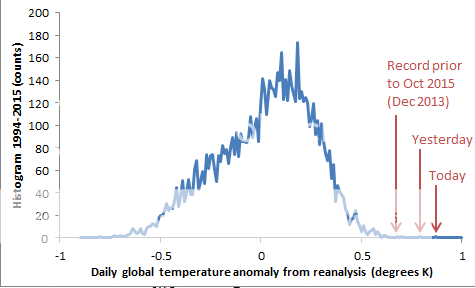
Update. Today 0.865. Extraordinary. I naturally wonder if something is going wrong with my program, but Joe Bastardi is noticing too:

Update. Ned W has made a histogram (see comments) showing how unusual these readings are.
Update: I have replaced the CSV at that link with a zipfile that contains the 2014/5 csv, a 1994-2013 csv, and a readme.
I see the associated WebGL map noticed the heat in Southern Australia. In Melbourne, we had two days at 35°C, which is very high for just two weeks after the equinox. And bad bushfires, also very unusual for early October.
Early results from TempLS mesh for Sept show a fall relative to August; TempLS grid is little changed. I'll post on that when more data is in.
Update. Today 0.865. Extraordinary. I naturally wonder if something is going wrong with my program, but Joe Bastardi is noticing too:
Update. Ned W has made a histogram (see comments) showing how unusual these readings are.
Wednesday, October 7, 2015
On partial derivatives
People have been arguing about partial derivatives (ATTP, Stoat, Lucia). It arises from a series of posts by David Evans. He is someone who has a tendency to find that climate science is all wrong, and he has discovered the right way. See Stoat for the usual unvarnished unbiased account. Anyway, DE has been saying that there is some fundamental issue with partial derivatives. This can resonate, because a lot of people, like DE, do not understand them.
I don't want to spend much time on DE's whole series. The reason is that, as noted by many, he creates hopeless confusion about the actual models he is talking about. He expounds the "basic model" of climate science, with no reference to a location where the reader can find out who advances such a model or what they say about it. It is a straw man. It may well be that it is a reasonable model. That seems to be his defence. But there is no use setting up a model, justifying it as reasonable, then criticising it for flaws, unless you do relate it to what someone else is saying. And of course, his sympathetic readers think he's talking about GCMs. When challenged on this, he just says that GCM's inherit the same faulty structure, or some such. With no justification. He actually writes nothing on how a real GCM works, and I don't think he knows.
So I'll focus on the partial derivatives issue, which has attracted discussion. Episode 4, is headlined Error 1: partial derivatives. His wife says, in the intro:
G = a1*T + a2*CO2 + a3*H2O
Now there may be dependencies, but that is a stand-alone equation. It expresses how G depends on those measurable quantities. It is true that the measured H2O may depend on T, but you don't need to know that. In fact, maybe sometimes the two are linked, sometimes not. If you put a pool cover over the oceans, the dependence might change, but the equation which expresses radiative balance would not.
If you do want to add a dependence relation
H2O = a4*T
then this is simply an extra equation in your system, and you can use it to reduce the number of variables:
G = (a1+a3*a4)*T + a2*CO2
And since at equilibrium you may want to say G=0, then
T =- a2*CO2/(a1+a3*a4)
expresses the algebra of feedback. But this is just standard linear systems. It doesn't say anything about the validity or otherwise of partial derivatives.
I don't want to spend much time on DE's whole series. The reason is that, as noted by many, he creates hopeless confusion about the actual models he is talking about. He expounds the "basic model" of climate science, with no reference to a location where the reader can find out who advances such a model or what they say about it. It is a straw man. It may well be that it is a reasonable model. That seems to be his defence. But there is no use setting up a model, justifying it as reasonable, then criticising it for flaws, unless you do relate it to what someone else is saying. And of course, his sympathetic readers think he's talking about GCMs. When challenged on this, he just says that GCM's inherit the same faulty structure, or some such. With no justification. He actually writes nothing on how a real GCM works, and I don't think he knows.
So I'll focus on the partial derivatives issue, which has attracted discussion. Episode 4, is headlined Error 1: partial derivatives. His wife says, in the intro:
"The big problem here is that a model built on the misuse of a basic maths technique that cannot be tested, should not ever, as in never, be described as 95% certain. Resting a theory on unverifiable and hypothetical quantities is asking for trouble. "Sounds bad, and was duly written up in ominous fashion by WUWT and Bishop Hill, and even echoed in the Murdoch press. The main text says:
The partial derivatives of dependent variables are strictly hypothetical and not empirically verifiableHe expands:
When a quantity depends on dependent variables (variables that depend on or affect one another), a partial derivative of the quantity “has no definite meaning” (from Auroux 2010, who gives a worked example), because of ambiguity over which variables are truly held constant and which change because they depend on the variable allowed to change.So I looked up Auroux. The story is here. DE has just taken an elementary introduction, which pointed out the ambiguity of the initial notation and explained what more was required (a suffix) to specify properly, and assumed, because he did not read to the bottom of the page, that it was describing an inadequacy of the PD concept.
So even if a mathematical expression for the net TOA downward flux G as a function of surface temperature and the other climate variables somehow existed, and a technical application of the partial differentiation rules produced something, we would not be sure what that something was — so it would be of little use in a model, let alone for determining something as vital as climate sensitivity.<
Multivariate Calculus
Partial derivatives can seem confusing because they mix the calculus treatment of non-linearity with dependent and independent variables. But there is an essential simplification:- The calculus part simply says that locally, non-linear functions can be approxiumated as linear. The considerations are basically the same with one variable or many.
- So all the issues of dependence, chain rule etc are present equally in the approximating linear systems, and you can sort them out there
Dependence
I'll use a simplified version of his radiative balance example, with G as nett TOA flux, here taken to depend on T, CO2 and H2O. The gas quantities are short for partial pressure, and T is (at least for DE) surface temperature. So, linearized for small perturbations,G = a1*T + a2*CO2 + a3*H2O
Now there may be dependencies, but that is a stand-alone equation. It expresses how G depends on those measurable quantities. It is true that the measured H2O may depend on T, but you don't need to know that. In fact, maybe sometimes the two are linked, sometimes not. If you put a pool cover over the oceans, the dependence might change, but the equation which expresses radiative balance would not.
If you do want to add a dependence relation
H2O = a4*T
then this is simply an extra equation in your system, and you can use it to reduce the number of variables:
G = (a1+a3*a4)*T + a2*CO2
And since at equilibrium you may want to say G=0, then
T =- a2*CO2/(a1+a3*a4)
expresses the algebra of feedback. But this is just standard linear systems. It doesn't say anything about the validity or otherwise of partial derivatives.
Saturday, October 3, 2015
NCEP/NCAR index up 0.06°C in September
The Moyhu NCEP/NCAR index from the reanalysis data was up from 0.306°C to 0.368°C in September. That makes September warmer by a large margin (0.05°C) than anything in that index in recent years. It looked likely to be even warmer, but cooled off a bit at the end.
A similar rise in GISS would bring it to 0.87°C. Putting the NCEP index on the 1951-1980 base (using GISS) would make it 0.95°C. I'd expect something in between. GISS' hottest month anomaly was Jan 2007 at 0.97°C. Hottest September (GISS) was in 2014, at 0.90°C. It was the hottest month of 2014.
The global map shows something unusual - warmth in the US and Eastern Canada. And a huge warm patch in the E Pacific. Mostly cold in Antarctica and Australia, but very warm in E Europe up to the Urals, and in Middle East.
Thursday, October 1, 2015
Optimised gridding for temperature
In a previous post I showed how a grid based on projecting a gridded cube onto a sphere could improve on a lat/lon grid, with a much less extreme singularity, and sensible neighbor relations between cells, which I could use for diffusion infilling. Victor Venema suggested that an icosahedron would be better. That is because when you project a face onto the sphere, element distortion gets worse away from the center, and icosahedron faces projected have 2/5 the area of cubes.
I have been revising my thinking and coding to have enough generality to make icosahedrons easy. But I also thought of a way to fix most of the distortion in a cube mapping. But first I'll just review why we want that uniformity.
I wrote a while ago about tesselation that created equal area cells, but did not have the grid aspect of each cell exactly adjoining four others. This is not so useful for my diffusion infill, where I need to recognise neighbors. That also creates sensitivity to uniformity, since stepping forward (in diffusion) should spread over equal distances.
The right is the same with the new mapping. You can see that near the cube corner, SW, in the left pic the cells get small, and a lot become empty. IOn the right, the corner cells actually have larger area than in the face centre, and there is a minimum size in between. Area is between +-15% of the center value. In the old grid, corner cells were about 20% area relative to central. So there are no longer a lot of empty cells near the corner. Instead, there are a few more in the interior (where cell size is minimum).
In that previous post, I showed a table of discrepancies in integrating a set of spherical harmonics over the irregularly distributed stations:
In the new grid, the corresponding results are:
Simply integrating the SH on the grid (top row) works very well in either. Just omitting the empty cells (bottom row), the new grid gives a modest improvement. But for the case of interest, with the infilling scheme, the result is considerably better than with the old grid.
But the mapping need not be simple projection. You could, for example, re-map the u space and then project. If f is a one-one mapping of the square of u onto itself, then the change in area going to z is:
det(f'(u))/(1+f2(u))^(3/2)
where the second factor comes from the projection, and includes the inverse square magnification and a cos term for the different angles of the du element and the sphere. f' is a Jacobian derivative on the 2D space, and the determinant gives the area ratio of that u mapping.
I use the mapping f(u)=1/r tan(r*u) on each parameter separately. The actual form of f doesn't matter very much. I choose tan because if tan(1/r)=sqrt(2) it gives the tesselation of great circles separated by equal longitude angle. That is already much better than simple projection (r=0). I can check by calculating what would happen to a square in the centre, mid-side, and corner, for various r:
The top row actually shows a slightly modified r; and the bottom two show ratios of area to the central area. For small r it is small, so areas vary by about 5:1. For the case of great circle slicing, it is about 2:1, and for larger r it gets better. I've chosen tan(1/r)=5/6.
hat means the midside areas are down by about 15%, and so most of the area is within that range. At the corners, a small section, it rises to +15%. There is associated distortion, so I don't think it is worth pushing r higher. That would improve average uniformity, but the ends would then be both large and distorted.
So here finally is the 24x24 WebGL plot equivalent to that from last time. Again it shows with drab colors empty cells, and with white lines the direction of reallocation of weights for infill. The resulting improved integration is discussed in the head plot.
I have been revising my thinking and coding to have enough generality to make icosahedrons easy. But I also thought of a way to fix most of the distortion in a cube mapping. But first I'll just review why we want that uniformity.
Grid criteria
The main reason why uniformity is good is that the error in integrating is determined by the largest cells. So with size variation, you need more cells in total. This becomes more significant with using a grid for integration of scattered points, because we expect that there is an optimum size. Too big and you have to worry about sample distribution within a cell; too small and there are too many empty cells. Even though I'm not sure where the optimum is, it's clear that you need reasonable uniformity to implement such an optimum.I wrote a while ago about tesselation that created equal area cells, but did not have the grid aspect of each cell exactly adjoining four others. This is not so useful for my diffusion infill, where I need to recognise neighbors. That also creates sensitivity to uniformity, since stepping forward (in diffusion) should spread over equal distances.
Optimised grid
I'll jump ahead at this stage to show the new grid. I'll explain below the fold how it is derived and of course, there will be a WebGL display. Both grids are based on a similarly placed cube. The left is the direct projection; you can see better detail in the previous post. Top row is just the geometry (16x16), the bottom shows the effect of varying data (as before 24x24, April 2015 TempLS). I've kept the coloring convention of s different checkerboard on each face, with drab colors for empty cells, and white lines showing neighbor connections that re-weight for empty cells. |  |
 |  |
The right is the same with the new mapping. You can see that near the cube corner, SW, in the left pic the cells get small, and a lot become empty. IOn the right, the corner cells actually have larger area than in the face centre, and there is a minimum size in between. Area is between +-15% of the center value. In the old grid, corner cells were about 20% area relative to central. So there are no longer a lot of empty cells near the corner. Instead, there are a few more in the interior (where cell size is minimum).
In that previous post, I showed a table of discrepancies in integrating a set of spherical harmonics over the irregularly distributed stations:
| L | 1 | 2 | 3 | 4 | 5 |
| Full grid | 0 | 0 | 0 | 0 | 1e-06 |
| Infilled grid | 8.8e-05 | 0.00029 | 0.001045 | 0.002015 | 0.003635 |
| No infill | 0.007632 | 0.027335 | 0.049327 | 0.064493 | 0.075291 |
In the new grid, the corresponding results are:
| L | 1 | 2 | 3 | 4 | 5 |
| Full grid | 0 | 0 | 0 | 0 | 1e-06 |
| Infilled grid | 8e-06 | 0.00019 | 0.000645 | 0.001348 | 0.002529 |
| No infill | 0.004758 | 0.02558 | 0.047794 | 0.0601 | 0.069348 |
Simply integrating the SH on the grid (top row) works very well in either. Just omitting the empty cells (bottom row), the new grid gives a modest improvement. But for the case of interest, with the infilling scheme, the result is considerably better than with the old grid.
Optimising
I think of two spaces - z, the actual sphere where the grid ends up, and u, the grid on each cube face. But in fact u can be thought of abstractly. We just need 6 rectangular grids for u, and a mapping from u to z.But the mapping need not be simple projection. You could, for example, re-map the u space and then project. If f is a one-one mapping of the square of u onto itself, then the change in area going to z is:
det(f'(u))/(1+f2(u))^(3/2)
where the second factor comes from the projection, and includes the inverse square magnification and a cos term for the different angles of the du element and the sphere. f' is a Jacobian derivative on the 2D space, and the determinant gives the area ratio of that u mapping.
I use the mapping f(u)=1/r tan(r*u) on each parameter separately. The actual form of f doesn't matter very much. I choose tan because if tan(1/r)=sqrt(2) it gives the tesselation of great circles separated by equal longitude angle. That is already much better than simple projection (r=0). I can check by calculating what would happen to a square in the centre, mid-side, and corner, for various r:
| 1/tan(1/r) | 0 | 0.7071 | 1 | 1.1312 | 1.2 |
| central | 1 | 1 | 1 | 1 | 1 |
| midside | 0.3536 | 0.5303 | 0.7071 | 0.8059 | 0.8627 |
| corner | 0.1925 | 0.433 | 0.7698 | 1 | 1.1458 |
So here finally is the 24x24 WebGL plot equivalent to that from last time. Again it shows with drab colors empty cells, and with white lines the direction of reallocation of weights for infill. The resulting improved integration is discussed in the head plot.
Subscribe to:
Posts (Atom)


