Update: New constructive algorithm appended.
Things are a bit quiet in climate blogging - so with a weekend coming I'll honor my ancient promise of diverting to some recreational math. I saw a few weeks ago a mention at Lucia's of the old
twelve coin problem. Twelve coins, one of which is fake and of different weight to the others, and to be found with three weighings on a balance (Update: the usual spec, as here, is that you also have to say whether it is heavier or lighter). This first came to prominence in WWII, when it was said to have become a distraction to the war effort in places like Bletchley Park, leading to suspicions that it had been planted by the Germans. A suggested counter was for the RAF to drop it on Germany.
I first encountered it when I started University; it was posed in circumstances where I was expected to be able to solve it, and I was embarrassed. A year later, I went to a lecture on information theory (newish in those days). I was struck by the proposition, helpful in later years, that the information in a result was a function of prior uncertainty. So that is the clue - each weighing should be arranged so each of 3 outcomes was as near equally probable as could be managed, maximising prior uncertainty. Then I could solve it easily, and also versions with more coins.
The basic constraint is that in N weighings there are 3
N possible outcomes, while with n coins, there are 2n situations to resolve, since only once coin is false, and could be heavy or light. So for 12 coins, there are 24 possibilities and 27 outcomes of 3 weighings, so it is tight but possible. An alternative to the equiprobable outcome method is a requirement that each weighing should be so that each outcome was resolvable with the remaining weighings.
When I saw it mentioned again, I started thinking of a constructive algorithm that would also prove feasibility for all cases where there were enough results to theoretically resolve. I had an idea of describing the proof, but then my other recent hobby of Javascript programming seemed it might help. So I've made an interactive version (below) with the information needed to solve.
You can choose a number of coins up to 121, and then start (or restart any time). There are boxes for left, right and off-scale. The buttons representing coins have colored bands top and maybe bottom. The top band is what I call the HL score. Initially each coin might the bad one, heavy or light (HL). But once there has been a weighing that tilted, some possibilities fail. On the side that dropped, the coins could no longer be light, hence H. On the other side, they are L. And any not on the balance must be good (G). So the total number of possibilities remaining is the HU score = 2*HL+H+L.
There is another more subtle score - DU. This applies to the coins on the balance before weighing, and relate to whether you will gain information if the left balance goes down or up. HL coins will always become either H or L, so they are not scored. But if left pan down, then L on left or H on right would then be known to be good, so they are marked as D; if the left pan went up, that would tell nothing new about D coins. And similarly H on left or L on R would be counted as R.
You can move coins to the right (cyclic) by mouse click, or left by click with shift key pressed. If they are H or L, you will see the lower DU bar change as they move. When a weighing has been set up, click the weigh button.
The color scheme for top bars is HL black; H orange; L blue and G yellow. For the bottom, only H and L coins on the balance have color, and it's red for D, green for U.
Here is an image of the gadget immediately following afirst weighing of 12 coins. Note the balance tilt. The four coins on the left are now H because they are on the heavy side, and U because they are H and left. On the right, they are L similarly, and also U. The off balance coins are all G, yellow.
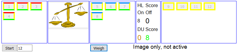
You'll see a table with the HL counts for on and off, and the D and U counts. Three are in large fonts, and those are the ones needed for solution. The strategy is that for every weighing, the D and U should be as near equal as possible, and the off HL score should be about half the on. More critically, each should be ≤ 3
M, where M is the number of weighings to follow after the one being set up. So in the image, for the next weighing, these numbers should all be ≤3. So take 3 off, then swap the others until the D and U scores are each ≤3. You'll see that as you rearrange, the system pads with known good coins (if available) to retain balance, and removes surplus. You can try to minimise usage of dummies; you should be able to reduce the need to at most two. If known good coins aren't available (first weighing), don't worry; the system will imagine them present.
So here is the gadget. Just press start, then move coins for weighing with click and shift-click, bearing in mind the above strategy. As long as the three big numbers are ≤ 3
M, you can solve in minimum weighings. It is solved when there is just one coin with H or L color showing.
I have to say, it is now a bit mechanical. You don't need to know the coin numbers, or even what the colors mean, as long as you keep your eye on the scores. But the Javascript isn't solving it - it's just adding up what you could count yourself, but displayed in a helpful way.
Update I have changed the DU score to count 1 each for HL (black) coins. This is more consistent when there are such coins. It means that all 3 large font numbers should now be made as nearly as possible equal an ≤3^M.
Update - proof
I originally planned this post as a constructive proof - show a method that is sure to work. I think the scoring goes a long way there. But a method can be spelt out. Suppose we have a set of coins with HL score g≤3N+1, to resolve in N+1 weighings. It's enough to show that a weighing can be made to reduce this to an assured score h≤3N. And the point of the big font numbers in the gadget is that they are the respective HL scores after each possible outcome.
Let g=2*p+q, where 3N≥p≥q≥0. Normally p=3N is OK, but if that leaves q<0, you can reduce p until q is positive. Then take a set of coins, HL score q (including all known good ones), to be kept off the balance. If all coins have HL score 2 (as at the start), that's still possible, because g and hence q must be even.
Then put the remaining coins one by one on the balance. Depending on what side, the D and U scores will increment by 1 or zero. Put all the H coins on first, alternating sides so the gap between D and U is never more than 1. Then the L, also so as to increase whichever of D,U is less. That will also alternate, so there will be a max imbalance of coin numbers of 2. Then finally, if there are HL coins, put them on whatever side improves coin number balance; each will increase both D and U by 1.
This ensures D+1≥U≥D. And since D+L is the HU score, when loaded, D=U=p≤3N. Since D,L and q are the respective HL scores after each possible balance result, and each ≤3N, that completes the proof.
Numbers of coins on each pan may differ by up to two. After the first weighing, this can be balanced by adding known good coins. On the first weighing, if g<3N-1, you can always choose p even, so the coins can split equally. In the worst case where g=3N-1 (eg 13 coins in 3 weighings) an external known good coin is needed.
Update: New constructive algorithm.
I thought of a simple constructive algorithm, with notation. Whenever a coin is on a tipped balance, you have half-knowledge about it. If it is on the down side, you know it can't be light, so I call it a H coin. On the other side, L. A known good coin I'll call G; one not half-known U
I'll call an odd trio, one that is HHL or HLL. An odd trio is the most that can be resolved in one weighing. You weigh an HL against a GG. If HL tips up, L is the culprit, if down, H. If balanced, you know the coin taken off is the bad one, and you know if it is H or L.
Any half-known duo duo can be resolved by just balancing one coin against a G. So at the end of the second weighing, we must have nothing harder than an odd trio.
So start with 8 on the scale, 4 off. This makes the 3 outcomes equally likely. If =, the 8 are G. Put 3 of the 4 on the scales, with one G. If = again, there is just one coin left, and can be weighted against a G. Otherwise, we have an odd trio.
If the first weighing tipped, remove a HHL, Leave a HLL in place, and interchange the remaining HL. Add a G to even coins for next weightng. If =, the odd trio HHL taken off has to be resolved. If it tips the HLL has it. If it tips the other way, the HL needs to be resolved.
In this table, each cell contains 3 groups. The first is the coins set aside, the other two are those placed on the scales. It stops after third weighing, because all outcomes can be resolved as odd trio or easier in third weighing.
| Weighing 1 | UUUU UUUU UUUU | | | | |
|
| Outcome 1 | GGGG HHHH LLLL | | | UUUU GGGG GGGG |
|
| Weighing 2 | HHL HGL LLH | | | U UU UG |
| | Outcome 2 | HHL GGG GGG | GGG HGG LLG | GGG GGL GGH | U GG GG | G HH LG
| Weighing 3 | H HL GG | L HL GG | L H G | G U G | H HL GG|
| | | | | |